
Time entry layout option- time entry on top, old notes on bottom
There is a new option available for entering time on a ticket. Previously the pane showing old notes was on the left side of the screen while the time entry form was on the right. Now you can view the time entry form above the old notes.
This is useful for engineers who don't need to refer to old notes while they enter time, for example because they are the only engineer who ever worked on the ticket.
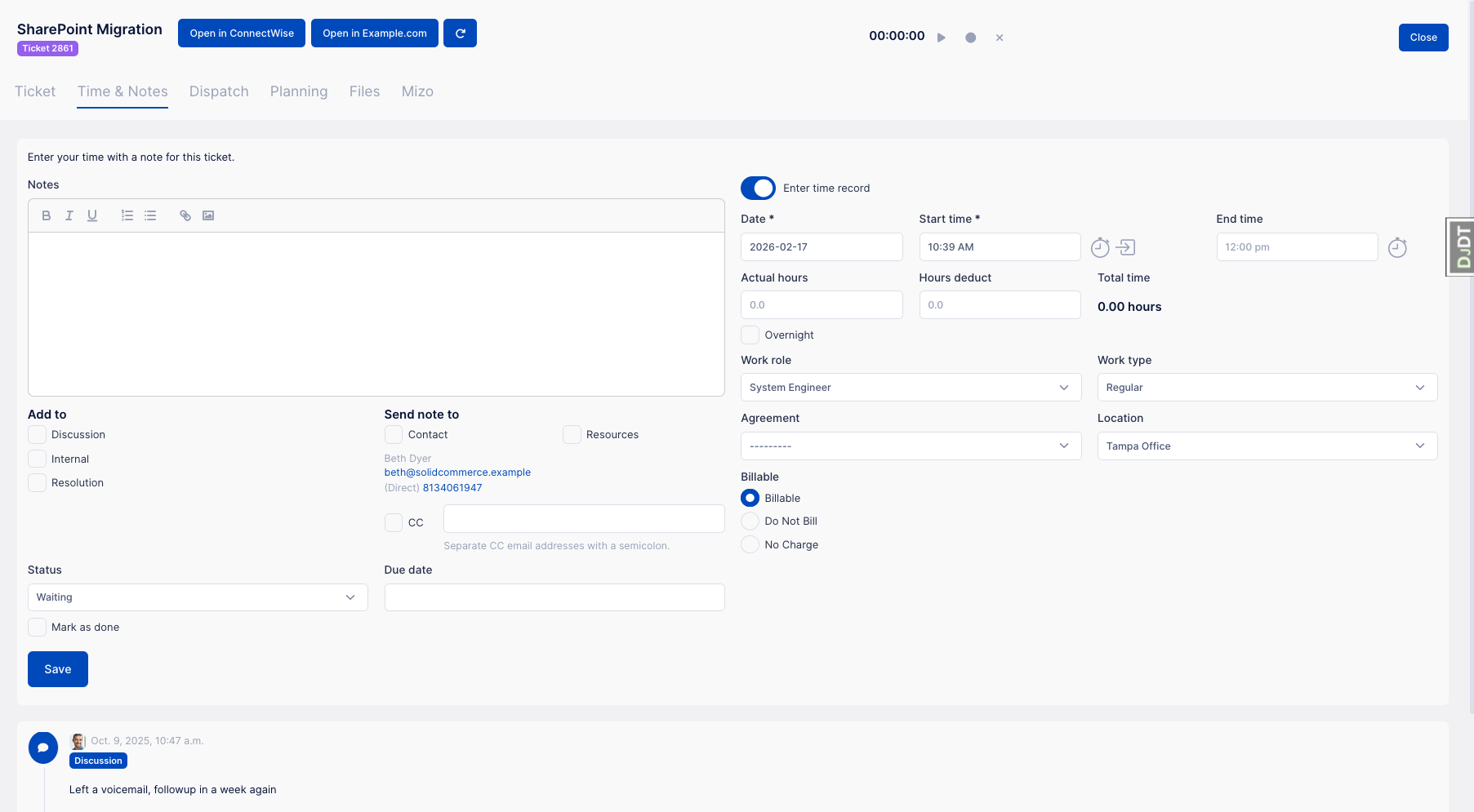
This is the time entry screen for ConnectWise users. It differs for Autotask or HaloPSA users but the overall layout is the same.
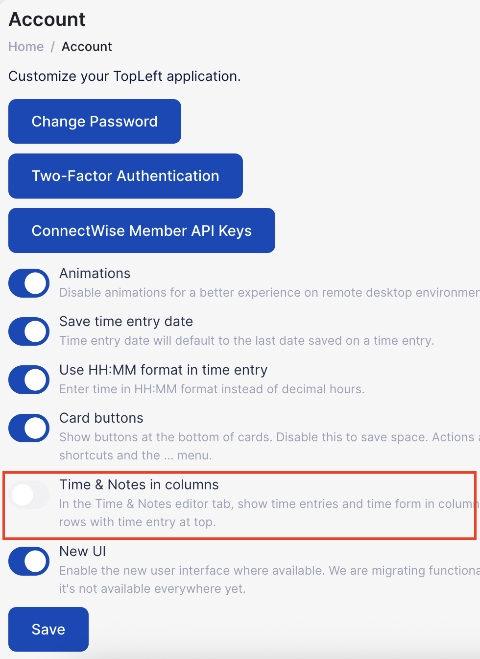
As a user you can enable this option in your own account settings. Click your avatar/initials in the top-right corner, then click Settings, then disable the "Time & Notes in columns" option.
Comments
No comments yet.